Free · Groupe iliad
Redesigning Free Proxi’s support tool, and laying the foundations of its first design system.
To comply with my non-disclosure agreement, I have changed some of the data and omitted some information in this case study.
Free launched Free Proxi, a local support service that quickly grew to around a hundred hubs across France. Facing that success, our team was asked to rethink the ticket management tool used by agents, for performance, user experience and scalability.
Context
Free Proxi hubs have agents fully dedicated to solving issues for Freebox and Free Mobile subscribers. As hubs kept opening and the user base grew, the internal tool started to show its limits: slow screens, bugs, visual inconsistencies and technical debt.
I worked in an agile core team with a Product Owner, a Proxy Product Owner and front-end and back-end developers, alongside SREs, project managers and iliad’s deputy managing director.
Goals
- Simplify the user flow and make the tool more intuitive
- Increase agent productivity and reduce the average handling time of a ticket
- Improve stability and reduce the number of bugs
Process
Discover: audit of the existing tool, UX audit, benchmark, shadowing, user interviews. Define: affinity diagram, stakeholder workshops, prioritisation. Develop: wireframes, Crazy 8 workshops, UI design, prototyping, design system. Test: user tests, beta with a community of agents. Deploy: release, continuous improvement, satisfaction survey.
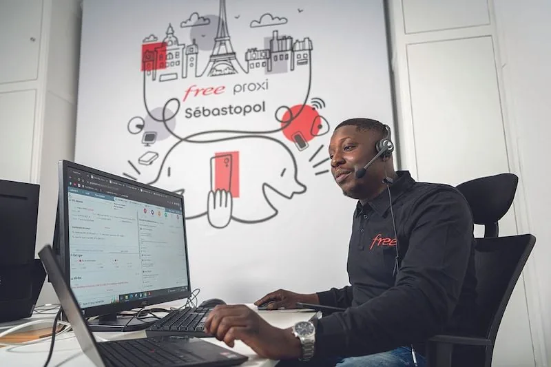
Shadowing
Watching agents in real situations showed us how they actually use the tool, where they get stuck, and which needs were left unmet.
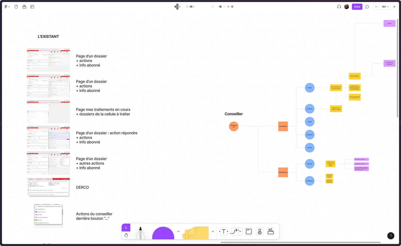
User flow
Mapping the existing journeys surfaced the friction points and opportunities, and helped plan a smooth transition that respects existing workflows.
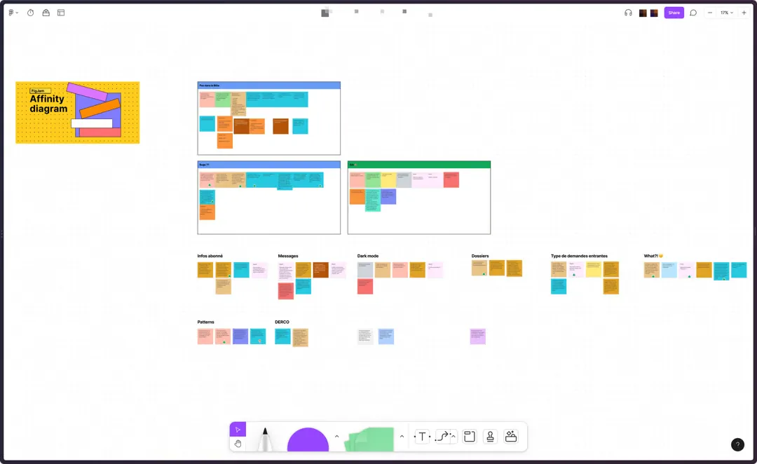
Interviews & affinity diagram
Interviews were grouped into themes with an affinity diagram, to prioritise the problems to solve.
What came out:
- Agents were mainly frustrated by how slow the tool was and by constant bugs.
- Despite the UX and UI flaws, they had built their own shortcuts to get through their tasks.
- Flows that forced them into third-party platforms were a recurring annoyance.
Stakeholder mapping
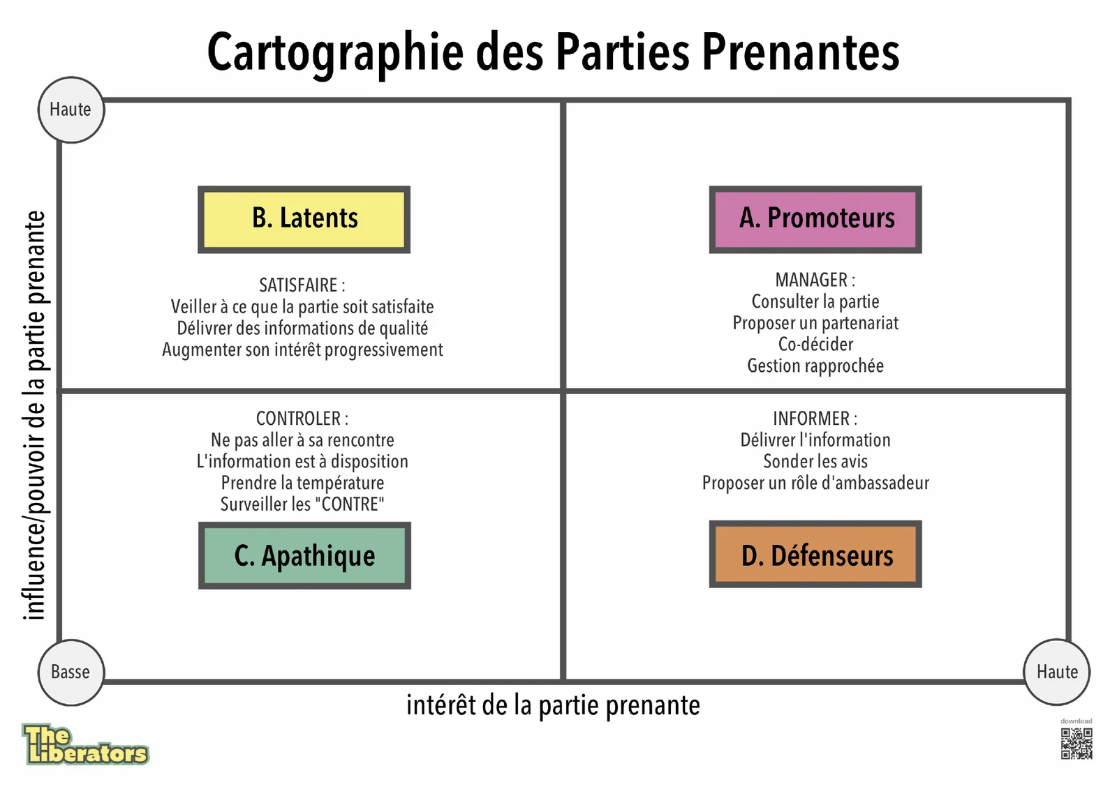
Clarifying each stakeholder’s influence and expectations helped prioritise communication and keep everyone engaged throughout the project.
Wireframes
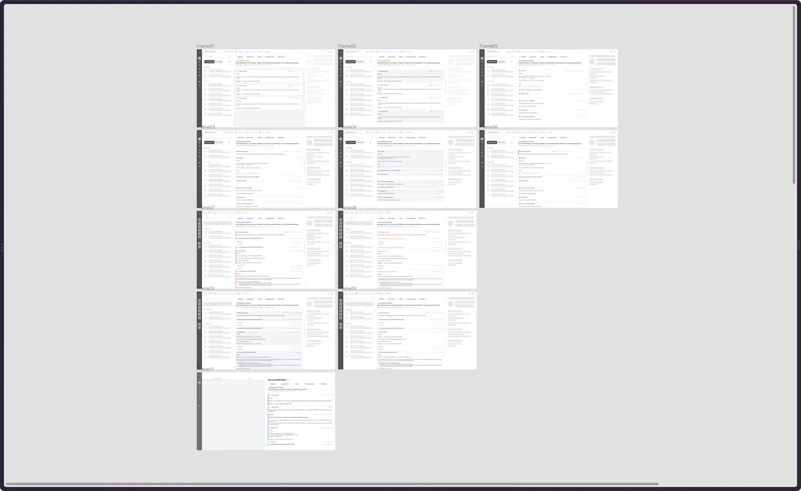
Low-fidelity wireframes to explore solutions quickly, validate navigation, and gather feedback from users and stakeholders.
High-fidelity interfaces
Prototype & test
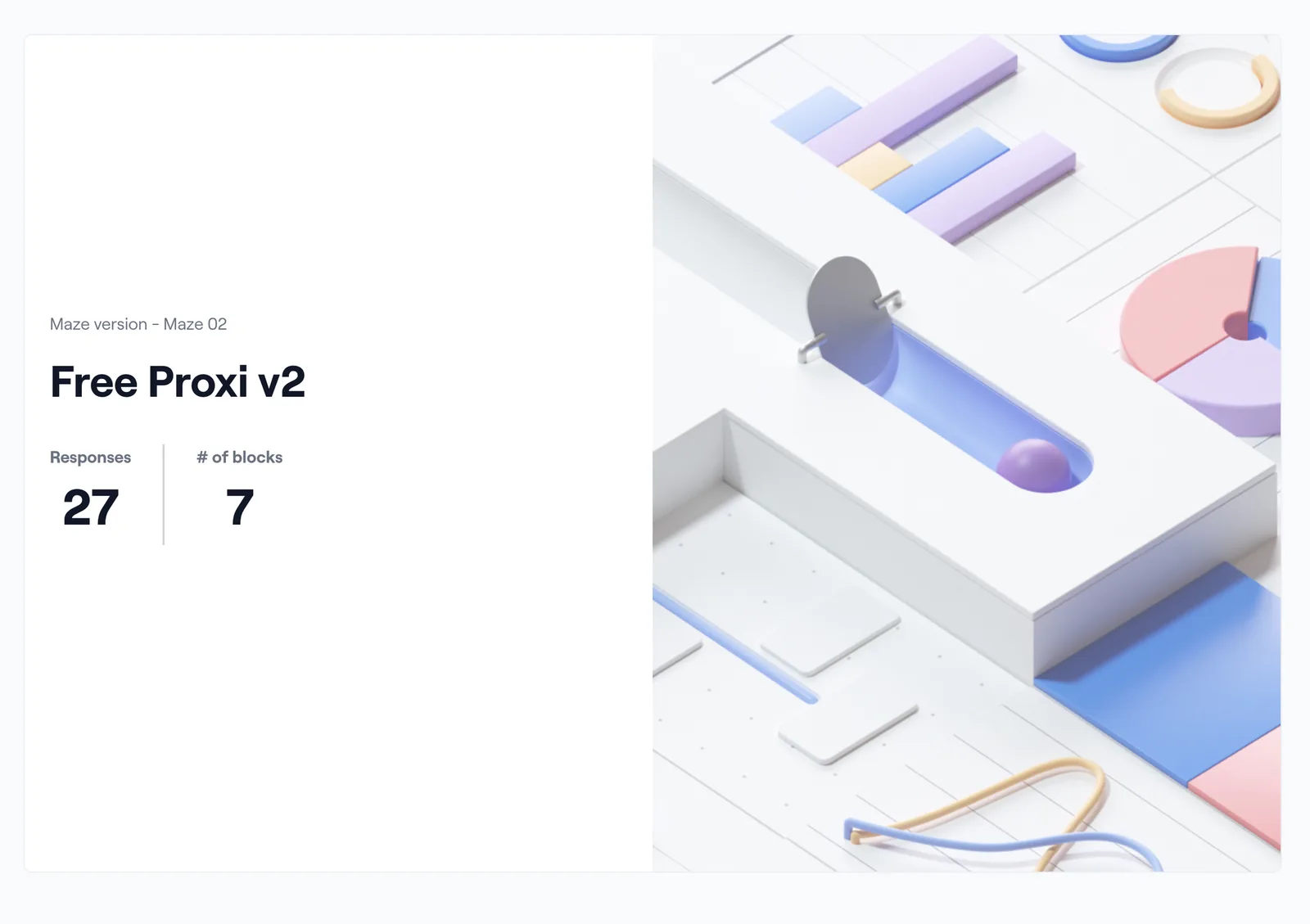
Interactive prototypes were tested on Maze and with a community of agents across France that I set up and ran on Workplace for the beta.
Design system foundations
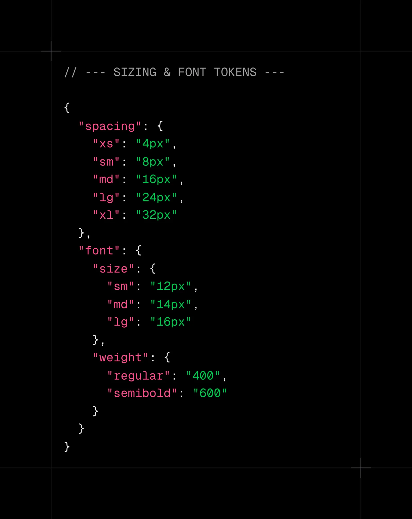
The redesign was the chance to clear the interface debt. I initiated the team’s first design system, with three goals: standardise components to lower agents’ cognitive load, speed up future features with reusable components, and prepare a friction-free dark mode.
I set up design system reviews with the main stakeholders and worked in four steps: an audit to quantify the debt (button variations, table styles…), a token structure defined with developers, a Figma library focused on the most reused elements, and tests with developers and designers. Components were documented in Storybook, with visual regression tests on Chromatic.
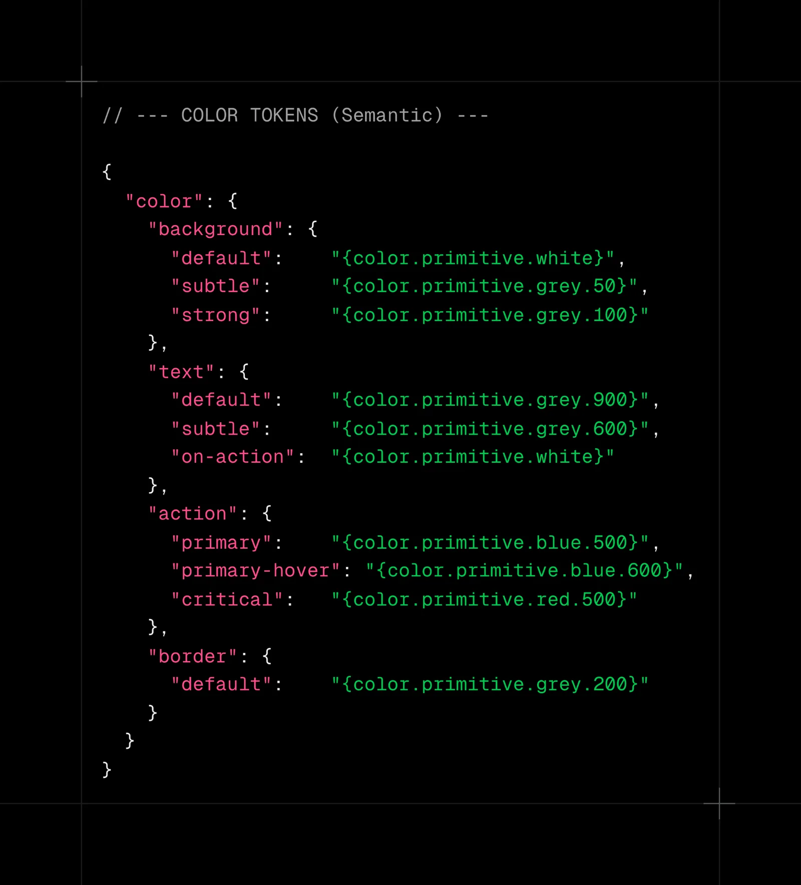
Semantic tokens
Separating the decision (background-default) from the value (#FFFFFF) gave designers and developers a shared language, and made theming possible.
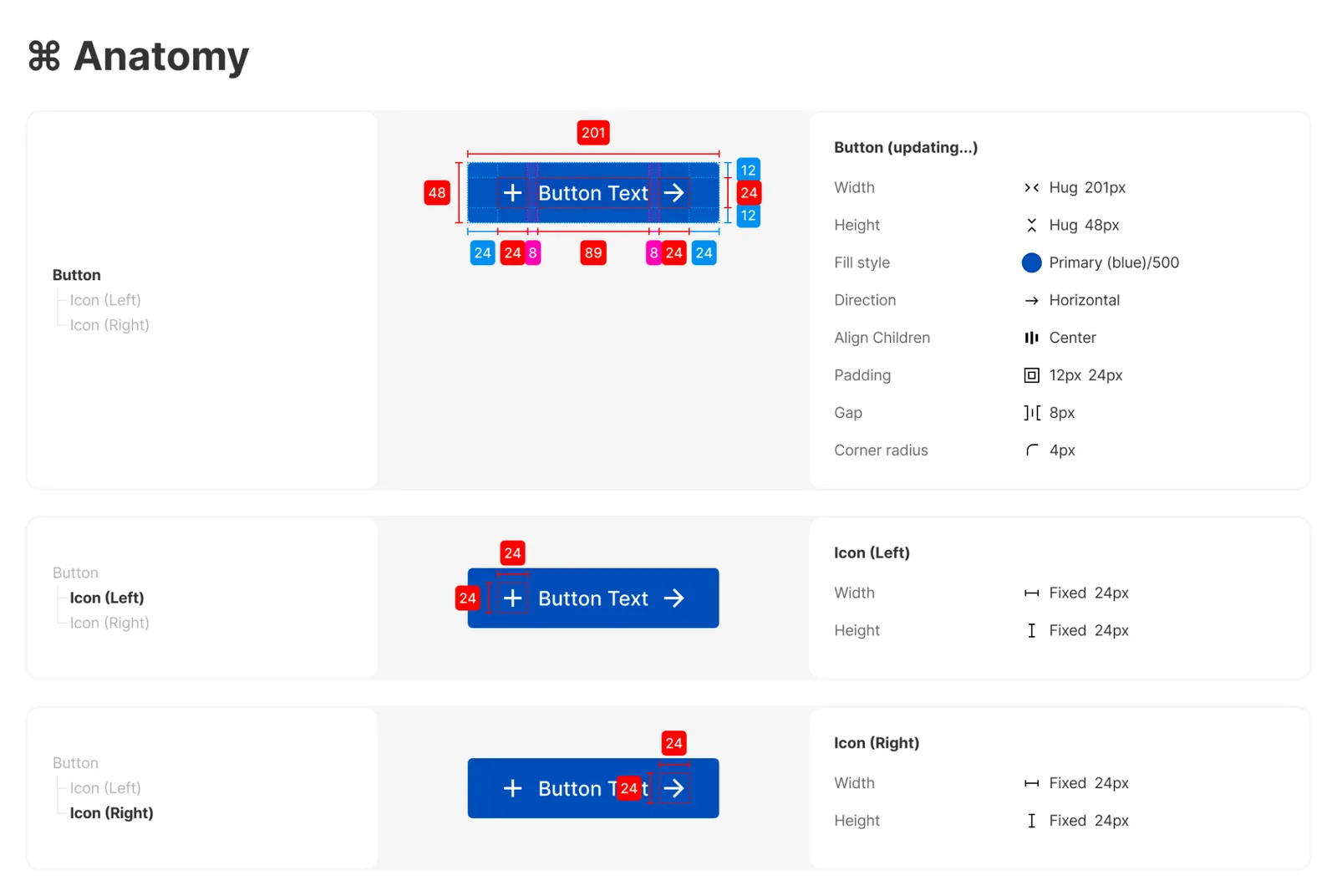
Anatomy of a component: the button
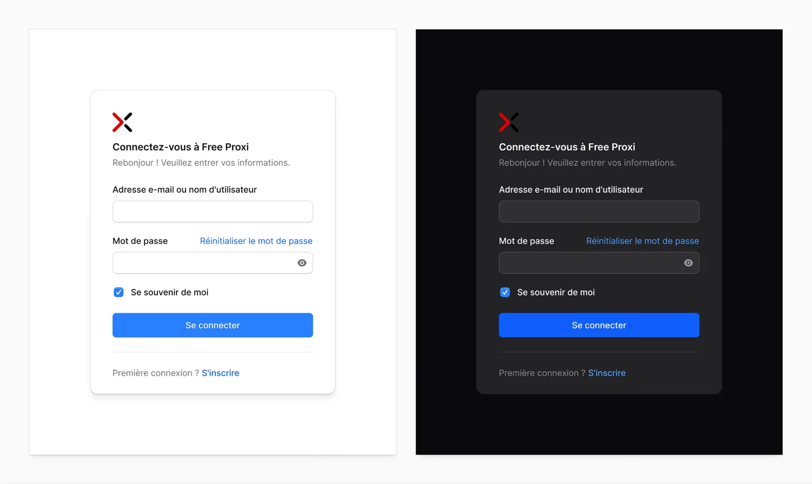
Dark mode
Switching to dark mode only means changing token values, without touching a single component. The same approach opens the door to other themes or white labels.
Impact
- A simpler, more intuitive journey, more productive agents and shorter ticket handling time
- A user community actively involved in development
- The audit built strong team consensus for the design system
- More technical, faster design/dev conversations and unified files
- Dark mode shipped quickly, with around 30% less development time expected on new views thanks to existing components
Learnings
The project took a lot of research, design and iteration because of its technical complexity and many business rules. We stayed pragmatic to bring as much value as possible to the company and users, and I learned how to balance research with proposing solutions.